The launch of the BMW iX3 also marks the arrival of a fresh look for the brand’s iconic roundel. While the changes are subtle, they represent the sixth major update to BMW’s badge since the company was founded in 1917.
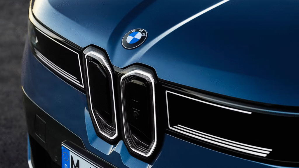
The familiar blue and white quarters remain, but the latest version simplifies the design by removing the inner ring and cross that separated the colours. The effect is cleaner and more precise, with the white areas now extending closer to the edge of the emblem. A matte black outer ring replaces the previous glossy finish, while the lettering has been refined with a high-end pattern inspired by luxury watchmaking.
Oliver Heilmer, head of design for the Neue Klasse programme, described the update as a balance of heritage and modernity. “We wanted to keep the history intact, but bring more precision to the logo,” he explained. “It’s flat to look at, but when you touch it you can still feel the ridges.” BMW has also dropped the blue border that once marked out its electric models, underlining its intent to integrate EVs seamlessly into the main line-up.
This latest update follows the digital-friendly transparent badge shown in 2020, which never reached production cars. Before that, the most recent long-standing version had been in use since 1997, with earlier variations dating back through 1963, 1953 and 1933 to the original 1917 design.
Despite its aviation origins, BMW has long stressed that the badge does not represent a propeller. The blue and white fields reflect the flag of Bavaria, with the propeller story tracing back to a 1929 advert that simply made convenient use of the logo in an aircraft image.
The refreshed emblem will gradually appear across BMW’s entire range as new models and updates are introduced, beginning with the iX3.